How to infuse some poetry in your pictures
A while ago, I had answered some questions to my photo school Nicéphore and they wrote an article about how I infuse poetry in my pictures. Because it’s in French and because i thought it would interest some of you, I decided to translate it (and add a few bits and pieces here and there) and to make this post the first part out of two of explaining my creative process:
Influences
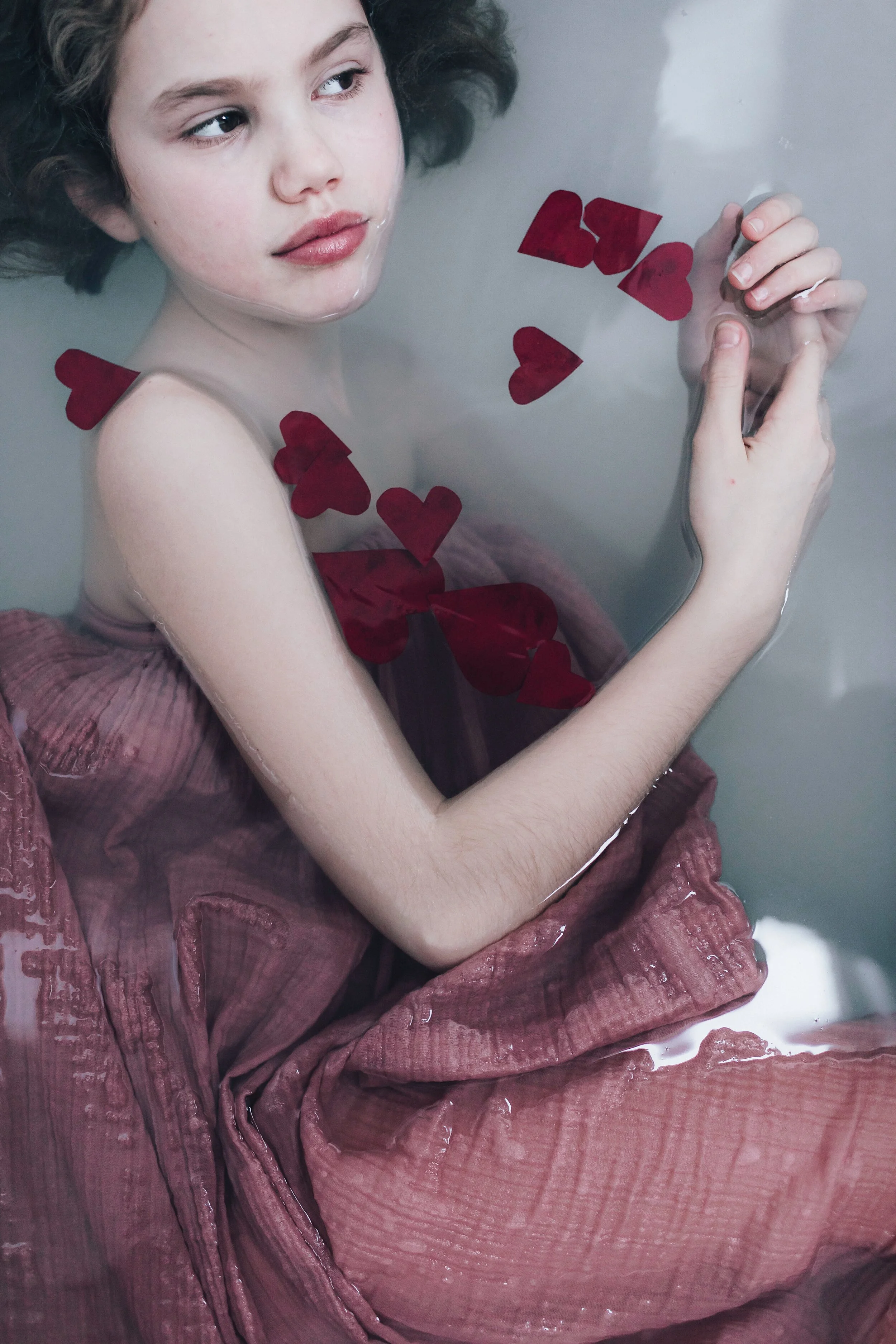
I get a lot of my influences in paintings, movies and music (and I’ll talk about that in my next post) but part of it also comes from fairy tales. I love what tends to evoque dreams, magic, fairy like moods.

You can check the whole woodland reveries portraits session here.
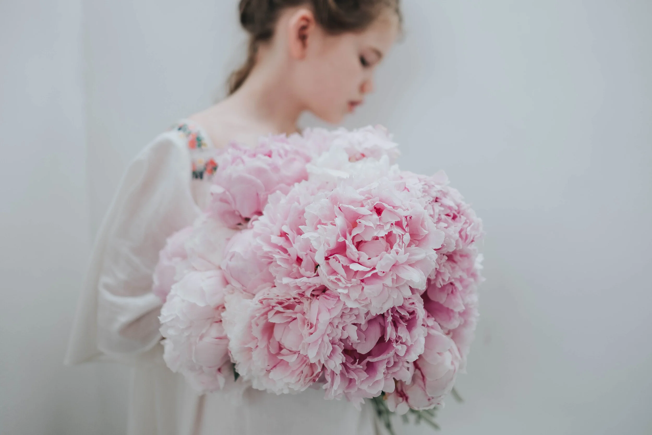
Color palettes
Aside from the fairy like themes that I love, I’m particularly attentive to the colors present in my images. Usually I find that soft pastel like tones will suit better poetry, so I will rarely use saturated bright colors such as red or green. It doesn’t mean you shouldn’t (I sometimes do too) but I know the softness will evoke poetry better. Otherwise, I’ll work in post production to desaturate some of the colours.
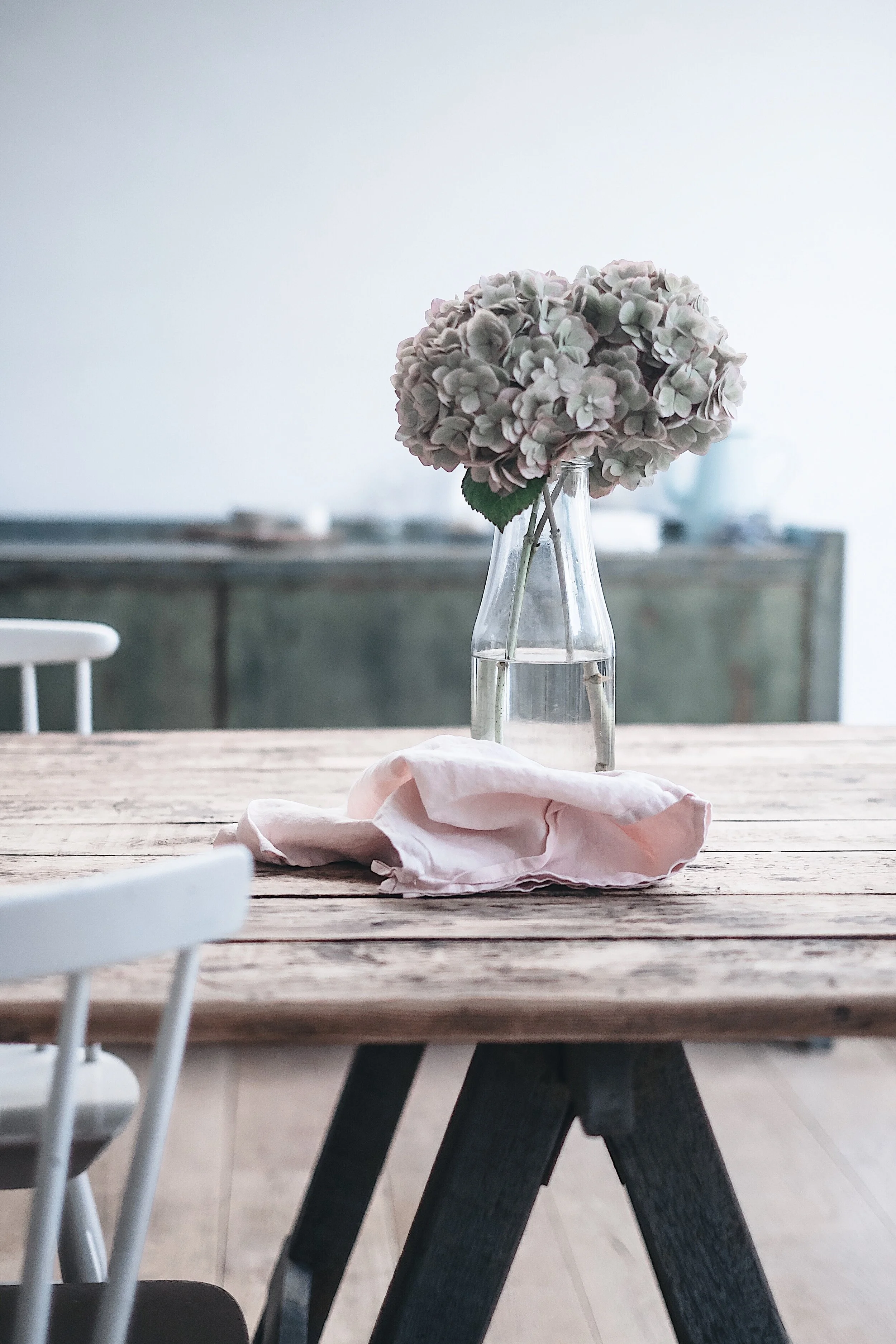
Aside from the soft tones, I do a lot of work on the colour harmonies. I think ahead and prior to a shoot on how colour combinations (monochromes, delicate contrasts etc.) will compose my photo especially when it comes to food styling (but also when styling a portrait). The dialogue in my head goes like this: “ If I use the pink linen kitchen towel, what flowers will match? what colour vase for the flowers?” “ if Lily is wearing that skirt, what top should she wear? what shoes? will that flower be nice with it”? I really picture it in my head. I’ll develop that aspect in the second part of my creativity process.

I love how the touches of dark green (the thuya branch) and light green (Eucalyptus), marries the bright pink of the beet. That’s what I usually picture before I even start styling.
On the following picture you can see the pale pink cake where the raspberries and the light green of the flowers are touches that will spark the atmosphere of the picture whereas the grey background gives an elegant and sober touch.

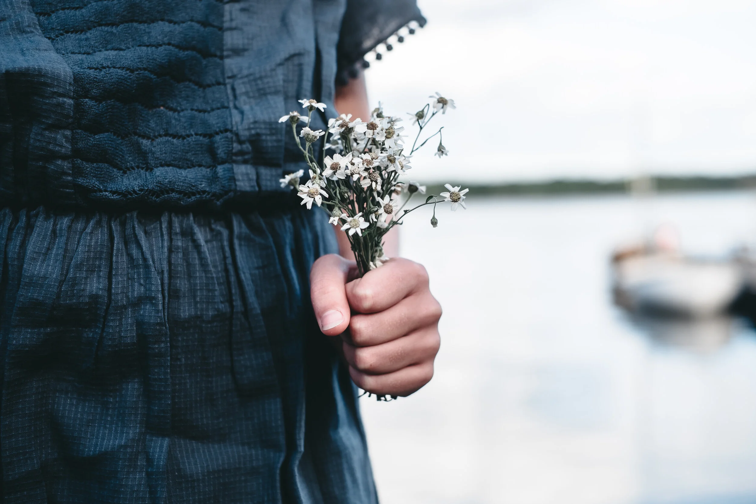
Or the next one where the harmonies of soft blues, green and white are completed by this desaturated touch of yellow from the daisies.
Light and location

Depending on the atmosphere I want to unfold, light will play a very big role (and I’ll come back to that part in my next newsletter). When wanting to evoke summer, childhood, obtain a lumnious atmosphere, I will choose the adequate place and time that are suitable for grazing light or flare effects. If I want a moody style (my favourite), I’ll place my subject near a window.
if I’m outside, I’ll choose an hour where the light if lower. It’s important for me to favour pockets of light instead of bright open light. Light will be your main tool for more candid pictures when wanting to evoke poetry.

This beautiful place with heather is in Sweden and I’m talking about it here.
The place of the shooting is very important too. Depending on the wanted atmosphere or style, it’s a very important factor because it’s going to participate in the scenery of the photography. Whenever I can (which means most of the time, not in Brussels haha), I’ll privilege fields, forest, seaside and wide open spaces. It also means that whenever I’m going away from the city, you can be sure that I will plan some shootings to take advantage of the opportunity. I’m not saying that city places or indoor can’t bring poetry out of your pictures, but I find nature always a best bet for it :)

Technique
From a very basic technical point of view, I have some habits. For instance, I think that a low aperture will favour a poetic aspect of the pic as it will highlight a particular part of the picture and blur the rest. I overall rarely shoot above 2.8. However, soft movement with a high aperture and a slow shutter speed will also offer a nice poetic blur.
I will also work a lot in post-production (via the software called Lightroom for those who don’t know). I rework the colours (and I mean all of them. I use the HSL: Hue, Saturation, Luminance and will really work every colours with those three tools). I might also highlight a particular area by brightening it and making the rest darker. If you are interested in how I edit my pictures, let me know, I can do a special post for this too.
Accessories and styling
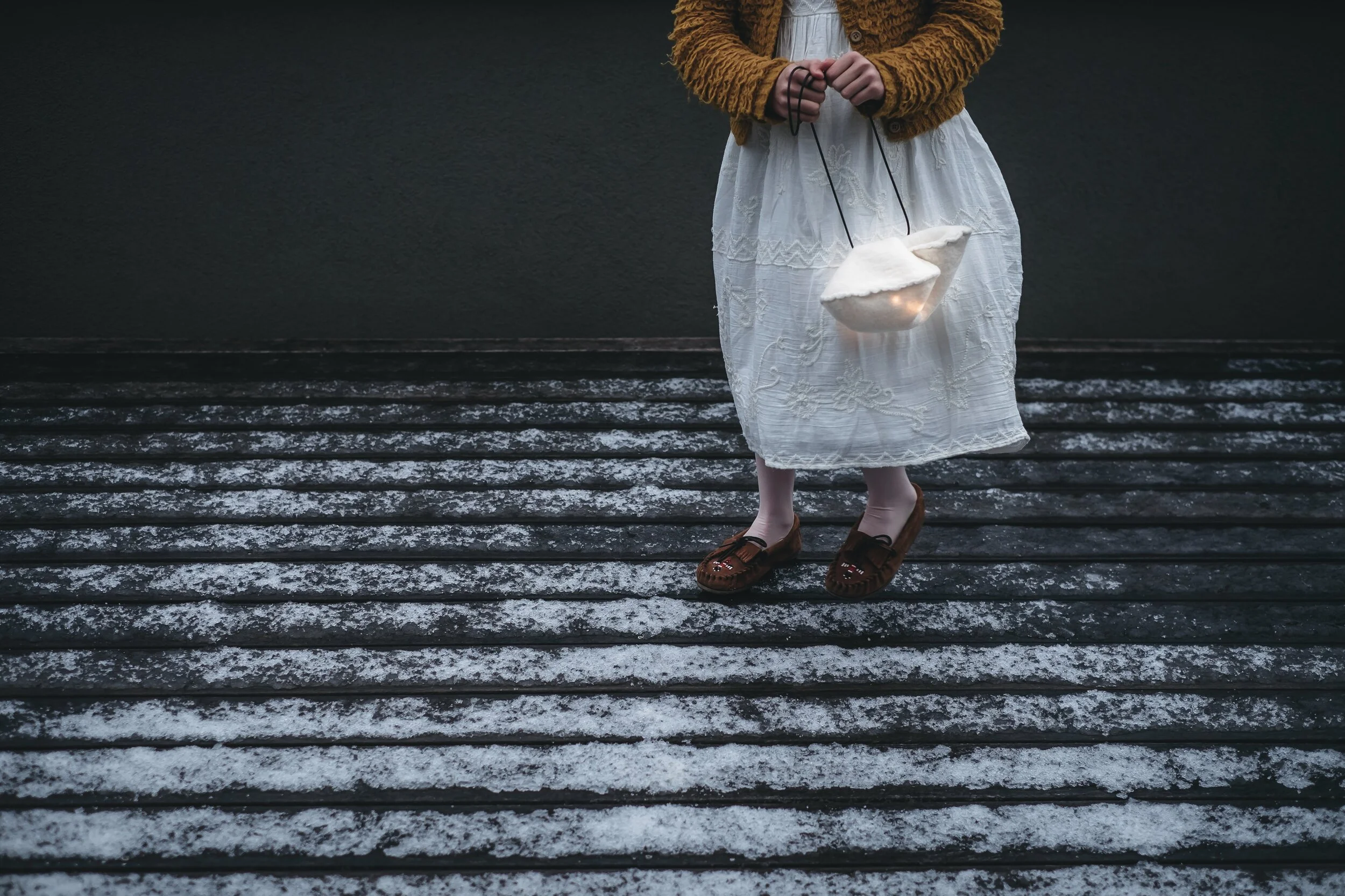
Accessories I choose will have a big role in my photographic style. Certain elements that I particularly love from which I think will emanate some sort of magic or poetry can be often found in my pictures: it can be fairy lights, glitter, candles, old pair of scissors, horns or bubbles… At least there will be some flowers!